


Gurmukhi Old Letterpress
Gurmukhi Old Letterpress - A font that is designed to represent a mechanically produced typeface from the early- to mid-20th century, before things became standardised with the Bani-fonts design that is so ubiquitous today.
History
William St. Clair Tisdall (1859–1928) produced a book called 'A Simplified Grammar and Reading Book of the Punjabi Language' which was aimed at teaching people Punjabi but based upon the flawed assumption that they were already familiar with Urdu - I am not and I can tell you that as a result of this, the book is pretty useless.
The purpose of the book can be better understood if you know that Tisdall was in fact a British Anglican Priest and his purpose in life was to convert Indians to Christianity, apparently rejoicing in the fact that he was taking an active part in a concerted attempt to destroy Indian culture and bring the population 'under control' as a result illustrated where he uses the words; "... it has by no means been utterly neglected by those engaged in the great work of extending the kingdom of Christ in the Panjab."
Here, I separate out and discard the, quite frankly, disgusting attitude towards other cultures of the author and instead, focus on the typography used in the book which, as far as I am aware, is the only example there is of this particular typeface. Why can't people just accept that everybody is different? His is typical of the Victorian attitude of; 'The trouble with going abroad is that you meet too many foreigners.'
So, the book does represent a period of history and ignoring that would be trying to re-write history. At this time, the printed letters have a unique appearance where the established writing style at the beginning of the 20th century met the requirement to produce a typeface for printing a book with all of the problems that that entailed. What we end up with is the result on the right - click on the image to see it larger in an new tab.
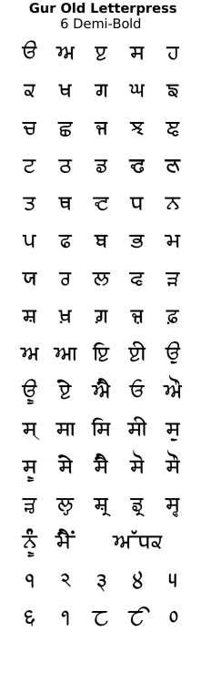
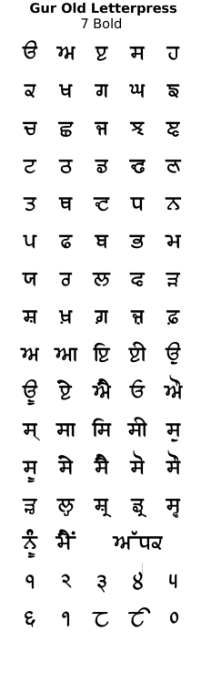
Font
On the right, you can see the sort of body text that is in the original book.
One thing that you might notice in the image above-right is that the kanna is almost as long as it is in Devanagari. This is the way that the print font was designed and as you can see, confusion is eliminated by the loop on the gagga being significantly smaller than the loop on the rarra so, when a rarra is followed by a kanna, it looks different to the gagga. The kanna has been preserved in the font because it is a character on its own.
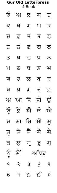
On the right, you can see the conjuncts used in the book. A number of them are standard any way but some of them are so indistinguishable from normal text that I have not used them.
So, all of the individual characters are preserved as they appear in the book but some of the conjuncts are not - 'sh' has been changed to the dotted version because it would have caused confusion in words such as 'shri'; 'tr' (ਤ੍ਰ) has been changed to the modern version because the version in the book (which looks a bit like ਤ੍ on some fonts) can be confused with ੜ.
There are some interesting characters in this font:
The two that is most likely to cause confusion to someone just glancing over a piece of text are going to be ਢ and ਦ which look a bit like a modern ਟ if you ignore the loops (although interestingly the ਟ in this font is more like the Devanagari equivalent ट).
- ਝ is closer to the 17th Century version with its 'c'-like bend at the bottom having evolved into a corner for this font, before it finally turns into a look in the modern version at the top;
- ਡ has the same, easily-recognisable loop at the bottom but the hole in it is circular;
- This has been carried on to ਢ and ਦ which have their loops in the same style but perhaps more noticably, the central body of these two characters is also circular - I suspect that in the pre-computerised, metal-cutting environment, when producing the initial metalworkings for these so that the lead type can be manufactured from them, circles are easier to manufacture than irregular shapes, especially when looking at the size of these things when producing small characters for typesetting books; and,
- ਵ (and also ਞ) have the same bottom section as the 17th century font.
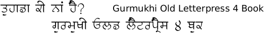
Click on the image below to see an example of work that can be done with this font. Note that towards the bottom of the image, you can see the paer characters.
Some examples of artwork with Gurmukhi Old Letterpress . . .
click on the image to open it up full-sized in another tab...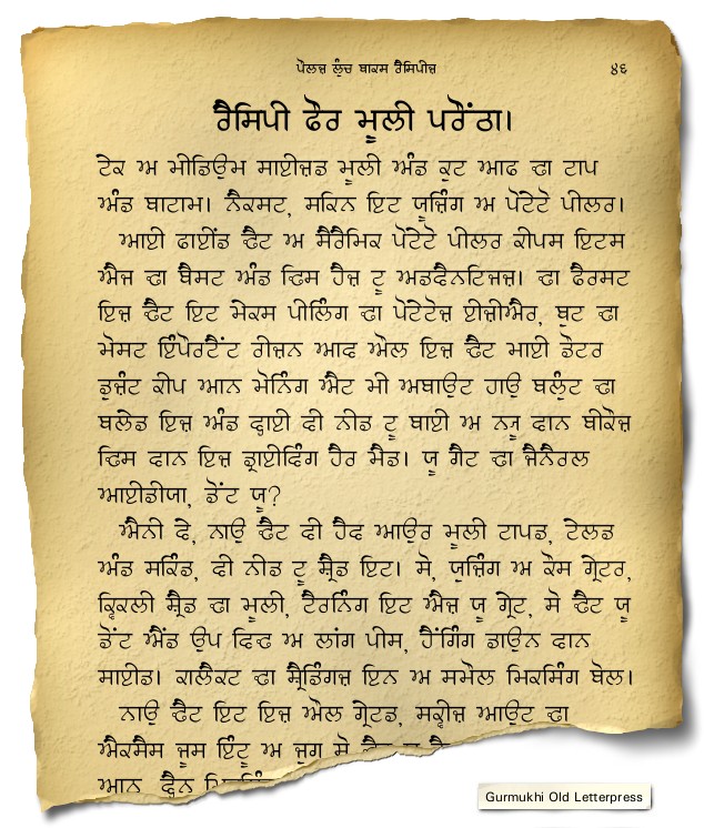

Hover the mouse over the images below to show examples of the font on a book cover

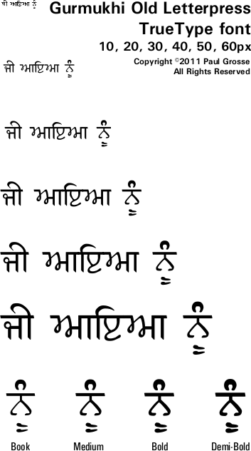
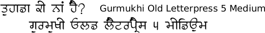
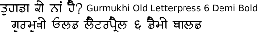
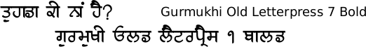
Hover the mouse over the images below to show examples of font characters and weights
Download Gurmukhi Old Letterpress . . .
Have you got the latest version of one of these fonts? If you have just downloaded it from this site, you have. Otherwise, you can check any font file by comparing the hash function results of the file on your computer with the values in the list by clicking here for text file and here for a web page - opens in a new tab. Select the font file on your system and look at the properties. Compare the hash result against the values in the table. These pages are kept up-to-date so whenever I update a font or create a new one, it will be on there.
Download All Fonts
You can download all of the fonts from all of the font families on this site in one compressed archive by clicking here for a ZIP file
or here for a TAR.GZ file

If you want to make a contribution directly using PayPal, my email address is paul.alan.grosse@gmail.com and please include your name and if relevant, your company and the project so that they can be included on the contributors page with a link if appropriate.
To see a list of contributors, click here.
Thank you.
Copyright ©2007-2023 Paul Alan Grosse.