


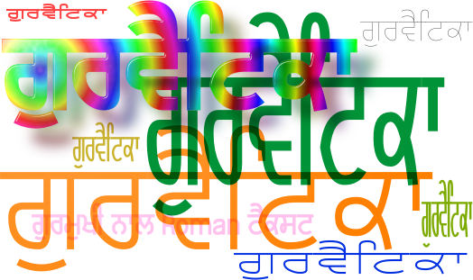
Gurvetica and Gurvetica A TrueType Fonts for free download. . .
About Gurvetica . . .
When you read text on a page, one level of consciousness has to work out what the letters are; passing that on to a higher level that works out what each word says and then passing this on to higher levels of consiousness to work out the meaning. At some point, this process breaks into the conscious levels of thought but the more of it that can remain within the subconscious levels of thought, the easier it is to glean information from the text - ie, the easier it is to read.
- A font that is difficult to read requires processing of the first stages to be done at a higher level, possibly even at conscious levels if the font is really bad - requiring more thought processing - and thus reading it is slower and more thought intensive.
- A font that is very legible, allows the first levels of processing to be done at the subconscious level, thus leaving the conscious levels to process meaning. This is achieved in fonts by having consistent features throughout the font such as consistent: weight; curves; end-of-line features; letter-part features; and, so on.
This is what Gurvetica tries to do but as a result of having Roman text exist in the same body text and be consistent with Gurmukhi text, some things have to be slightly different from our Grotesque, Swiss friend.
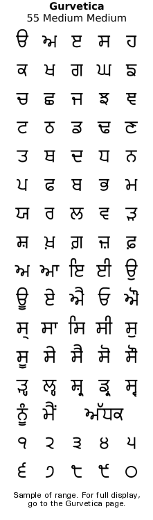
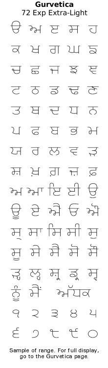
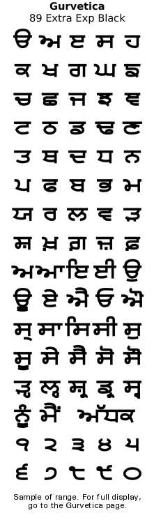
Gurvetica is designed to have high legibility - in a similar way to the popular font Helvetica, hence the name* - but in the context of Gurmukhi text. As a result, rather than being just a clone of Helvetica, it differs from Helvetica in some areas such as: deliberately not complying with Helvetica's 'only horizontal- or vertical-ends of letter lines' simply because doing so makes Gurmukhi ugly; deliberate monolinear design for higher legibility; and, font sizes 'growing' from central lines because they are based on the bar rather than fitting between two lines. These give it better legibility.
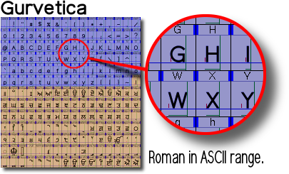
The font comes in two types: 'Gurvetica' and 'Gurvetica A'. You can have both installed at the same time and they will co-exist without any problems. However, if you just want one, you need to know the differences.
Do I want 'Gurvetica' or 'Gurvetica A'? In the UTF-8 Gurmukhi range, both fonts are identical. However, they differ in what they do with the ASCII range... Gurvetica has Roman characters in the ASCII range of the font and Gurmukhi in its own range - something that has been standard since Windows XP.
This means that you can mix Roman and Gurmukhi text in the same paragraph and keep a consistent appearance using just one font.
The Roman characters match the weight, height and width of the Gurmukhi characters in the font.
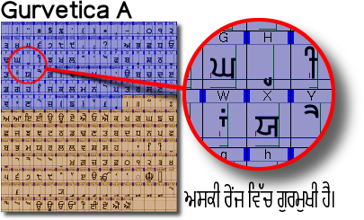
Gurvetica A has Gurmukhi characters in the ASCII range.
This font allows you to use it on older pieces of text that haven't been updates and still use the ASCII range for Gurmukhi characters.
However, this means that if you want Roman text in there, you need to use a different font.
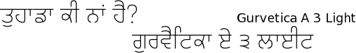
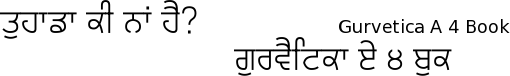
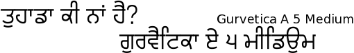
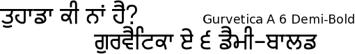
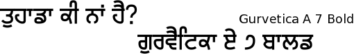
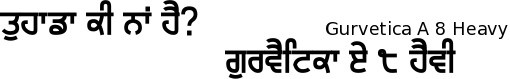
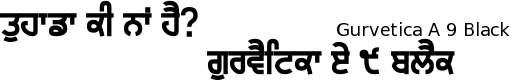
In addition, Gurvetica (with Roman characters) comes in a variety of widths whereas Gurvetica A only has the medium width. Why Roman characters ? . . .
In newspapers and other media where a mixture of Gurmukhi and Roman characters become necessary, you often see fonts that just don't fit.
Existing practice Using Gurvetica
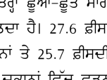
On the left, you can see a reproduction of an example from an exam paper where the Roman text font just doesn't fit in at all. The style (serif instead of sans serif) the size, weight, alignment and so on are all wrong. On the right, you can see that when using Gurvetica, these attributes do match the Gurmukhi font.
Again, with numbers, this time, on the left, you can see a reproduction of an example from a newspaper where the Roman numbers font just doesn't fit in at all. Again, the style (not monolinear) the size, weight and so on are all wrong. Again, on the right, you can see that when using Gurvetica, these attributes do match the Gurmukhi font.
Here, you can see that the Roman text fits in with the Gurmukhi text even at different weights so that it does not look out of place and maintains its legibility.
Why Monolinear ? . . .
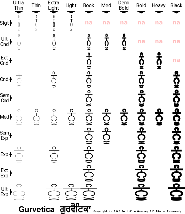
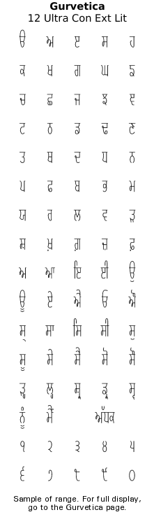
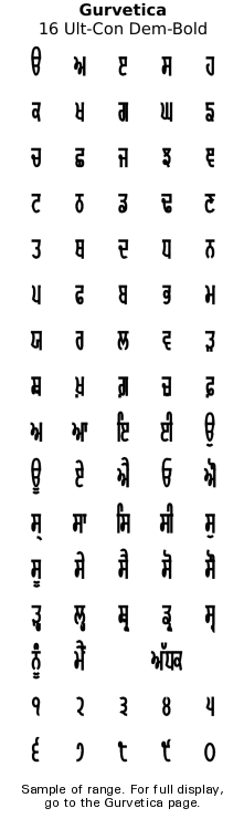
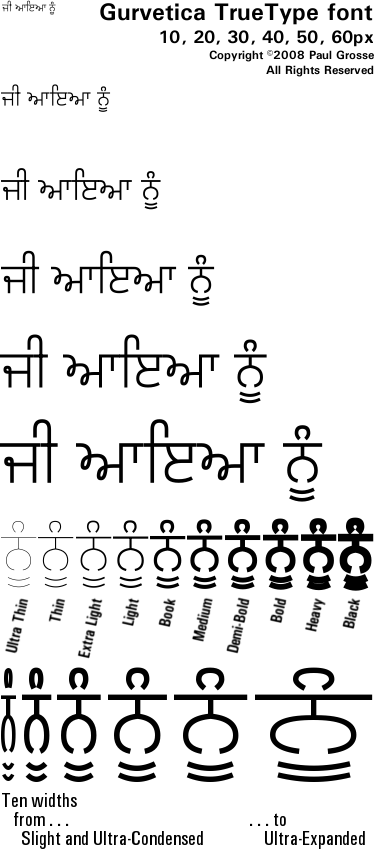
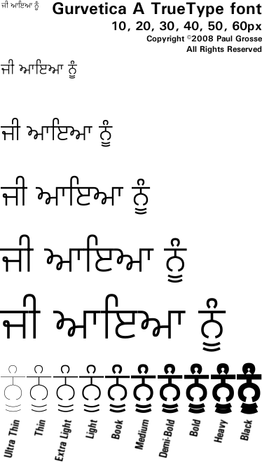
The Gurvetica font is designed to be very legible at any font size, both in body and display text. It is intended for production use and is supplied in a number of widths and weights so that instead of stretching or compressing the font, you just choose a different width. By choosing different widths, you keep a more legible font because people don't need to keep swapping from narrow verticals to wide verticals and so on. Look at this font sample PFD to see what I mean.
Here is an example of text from a newspaper, showing how the people responsible for setting it have just taken the normal font and stretched/compressed it so that it fits the required width.
As a result, you end up with some text that has wide horizontals and narrow verticals and other text that is the other way around. Whilst one or the other is all right if it occurs on its own, seeing both together reduces legibility of the text.
In the image on the right, the left half is a sample from a newspaper with three headline/straplines from one article - mixing both within one strapline.
On the right, you can see the same text, with a fairly close match to the width/weight of the original, but using a monolinear font (Gurvetica).
You can see that the vertical and horizontal lines have the same width and it is a whole lot more legible.
From that starting point, if you did need to tweak the width a bit, you could do so by stretchng/compressing, but by so little that you did not impair the legibility of the text.
Another application of monolinear fonts is on film posters where width to height ratios of the credit text is around 6:1 or 8:1.
Using a normal font and compressing it to achieve those ratios would produce such an extreme that it would have extremely low legibility.
Hollywood uses monolinear fonts for such text so Gurvetica, with its deliberate use of monolinear design allows the same to happen with Gurmukhi text.
On the right is some example text that is rendered so that it appears on your screen at a reasonable size. If you want to see what it would look like on paper, download the fonts and try it out.
Another advantage of monolinear fonts is that at small font sizes, such as those found in books, the laanv and horda are a lot easier to differentiate.
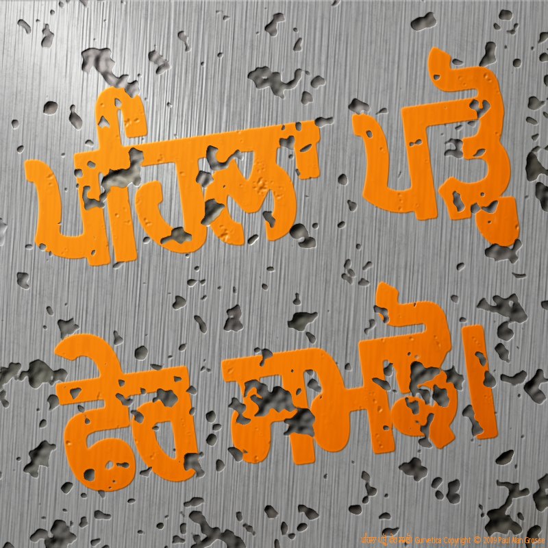
Some examples of artwork with Gurvetica . . .
click on the image to open it up full-sized in another tab...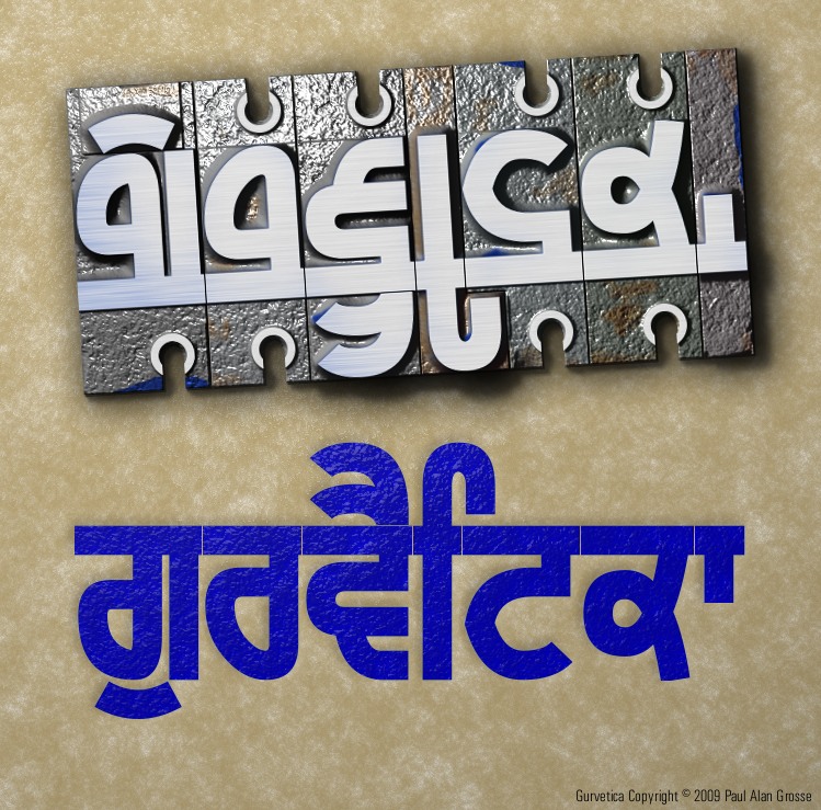


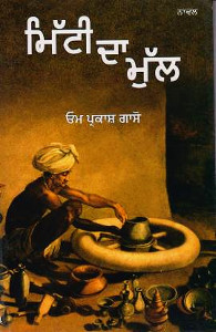
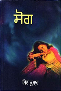
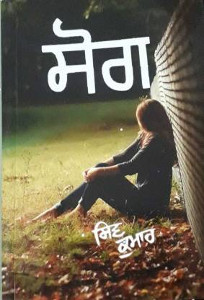
Hover the mouse over the images below to show examples of the font on book covers

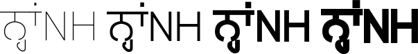
Hover the mouse over the images below to show examples of font characters and weights
Download Gurvetica . . .
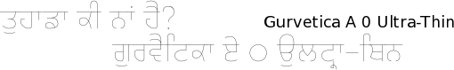
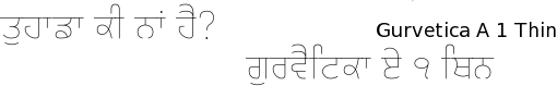
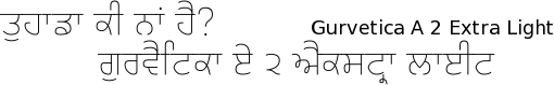
Gurvetica has a number of width options as well as weight options. You can see from the screenshot on the right that your word processor organises them into widths (the first digit) and weights (the second digit) so that they are easy to find.
Below is the download matrix. It is quite easy to use because the fonts are organised in the same way - hover the mouse over the links to see what you will get when you click on them.
Download Gurvetica A . . .
*Incidentally, 'Helvetica' cannot be trademarked because it falls under the category 'generic or geographical names', being the latin adjective for 'Swiss'.
However, 'Gurvetica' is not generic or geographical and therefore can be trademarked - coming under British Civil Law as it does. As such, the trademark belongs to me, Paul Alan Grosse, and anybody using it for something other than my Gurvetica font is doing what is called 'passing off', damagaingthe good will or reputation of my trademark.
Have you got the latest version of one of these fonts? If you have just downloaded it from this site, you have. Otherwise, you can check any font file by comparing the hash function results of the file on your computer with the values in the list by clicking here for text file and here for a web page - opens in a new tab. Select the font file on your system and look at the properties. Compare the hash result against the values in the table. These pages are kept up-to-date so whenever I update a font or create a new one, it will be on there.
Download All Fonts
You can download all of the fonts from all of the font families on this site in one compressed archive by clicking here for a ZIP file
or here for a TAR.GZ file

If you want to make a contribution directly using PayPal, my email address is paul.alan.grosse@gmail.com and please include your name and if relevant, your company and the project so that they can be included on the contributors page with a link if appropriate.
To see a list of contributors, click here.
Thank you.
Copyright ©2007-2023 Paul Alan Grosse.