Letters, row 1 - ੳ ਅ ੲ ਸ ਹ . . .
This is the first page of letters. It is assumed that you already know everything else you need to know about them and therefore, you are only learning how to write them. With this in mind, they alphbet is shown a full row at a time
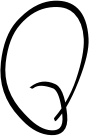
ੳ
Oordaa starts off in the usual place - on the line - but misses out the middle part of the '3' that you draw before you take the pen to the left and then upwards to form the rest of the letter. This makes it fast.
As for the size of the upper part of the letter, it is the only letter that has anything above the line so it doesn't really matter. If you are writing quickly, it will tend to be large.
One possible source of confusion is if you are writing ਹਿ or ਤਿ and don't take the pen off the paper before you start writing the sihari.
ਅ
If you look at the Gurbani-style aerdaa and ghaggaa - ਅ & ਘ - you will see that they are, in terms of shape, related similarly to the way that 'm' and 'w' (or 'n' and 'u') are. This is reflected in they way they are handwritten like so...

.
Aerdaa starts off like a letter 'n' and then you have a bit of a squiggle - just to occupy the space and reduce any potiential for confusion.
ੲ This is just a squiggle that is a bit like a tainkaa. You will never use it on its own unless you are using it as the third part of a letter defined list (ie, ੳ: ਅ: ੲ: ਸ: and so on).
When you use it with a sihari or a bihari, you can use that to draw the vertical line like so...
and
.
You could confuse this with tainkaa with a sihari or bihari so just make sure that you make them unambiguous.
ਸ
If you look at ਸ on the left, you can see that it is basically an 'n' with a line over the top.
The top line is not a compulsary feature of this writing so the right-hand side doesn't have to go back upto the bar level to finish off the letter.
You need the line over the top of
(ਸ) to differentiate it from
(ਮ) as you can see in ਸਮਝਉਂਦੇ above-right.
ਹ There's not a lot of difference between the way that you would write this neatly and this way.
There are some letters that are similar but this way of writing is clearer than the Gurbani way of writing them.
ਹ ਰ ਕ
Copyright ©2007-2023 Paul Alan Grosse.